With our new release, the colors used by your apps are customizable. You only need to set one or a few colors to give your apps a complete visual refresh with a custom color scheme. If you like, you can also set colors individually for the various parts of your apps, giving you very precise control over the colors used.
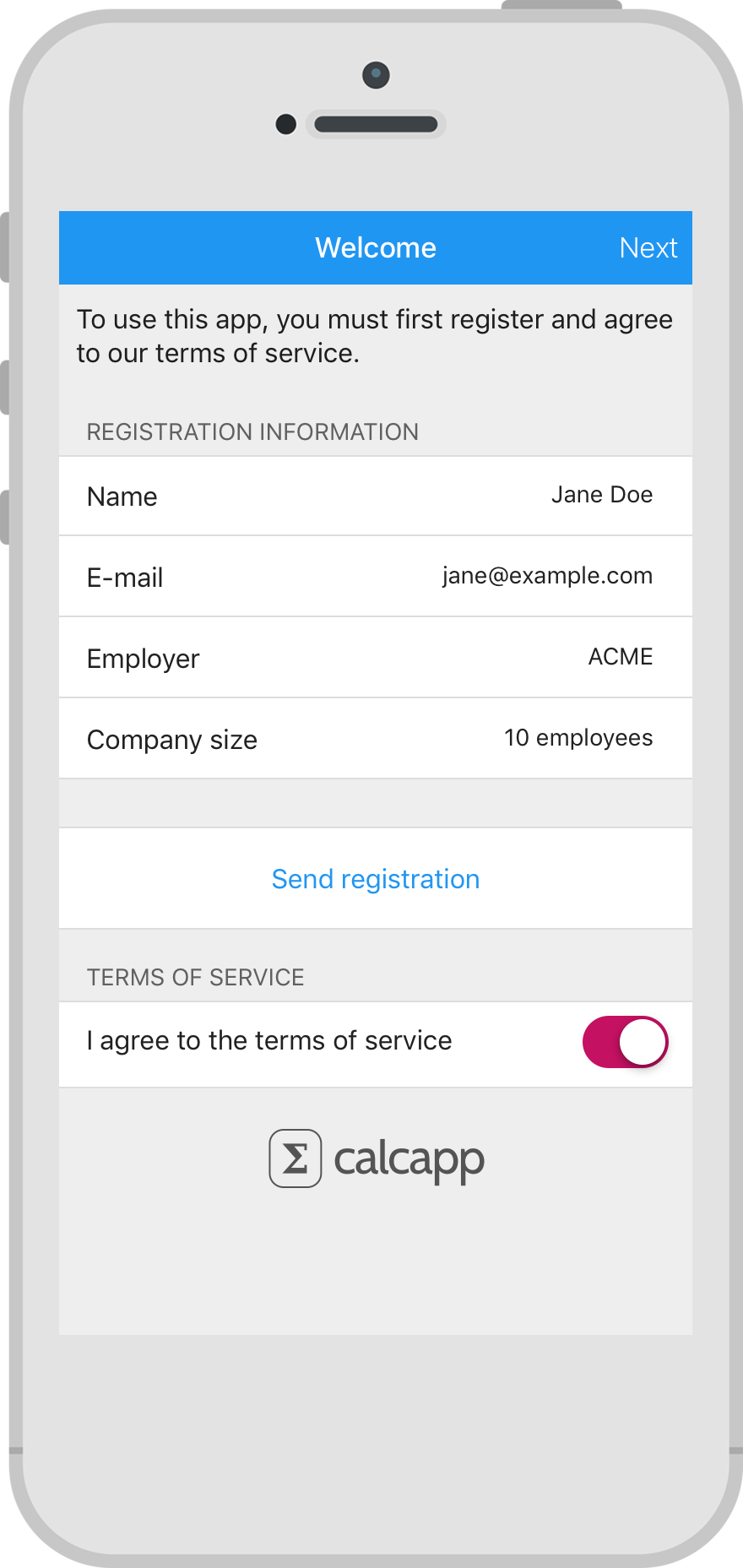
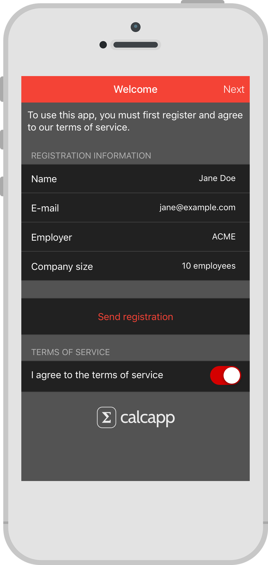
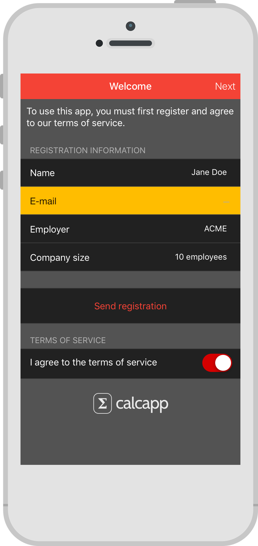
In March, we showed you how to build a form asking users to register their name and email address. Here’s that form, with the default colors shown in the first image and a custom color scheme shown in the second image:
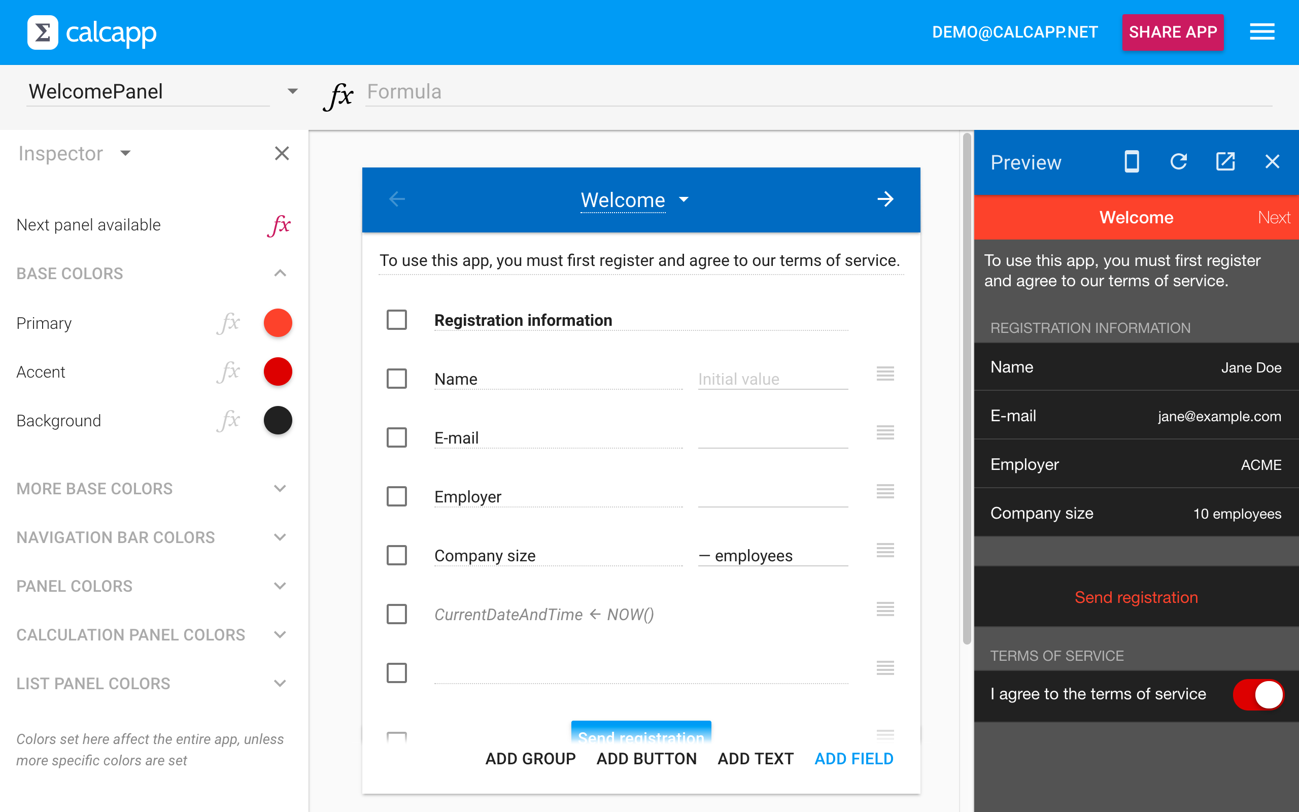
The custom colors are set in the inspector for the calculation panel (using the new color picker):
Base colors
Only three custom colors have been set in the inspector in the image above: a primary color, an accent color and a background color. The primary color is used for things like the navigation bar and button labels and the accent color is used for smaller areas that should stand out, like the thumb of a oswitch field. The background color is used for the areas behind fields, buttons and list panel options.
These three colors are base colors, meaning that lots of other colors are automatically based on them. For instance, the light gray color used behind the fields in the registration form images above is known as the backdrop color. It can be set explicitly, but will automatically be set to a lighter or a darker version of the background color if not set. (When a color isn’t set, the inspector displays the symbol.) In the registration form image with the custom color scheme, the background color is set to black and the backdrop color isn’t set, so Calcapp automatically uses a lighter version of the background color for the backdrop color.
There are three more base colors: a light foreground color, a dark foreground color and a warning color:
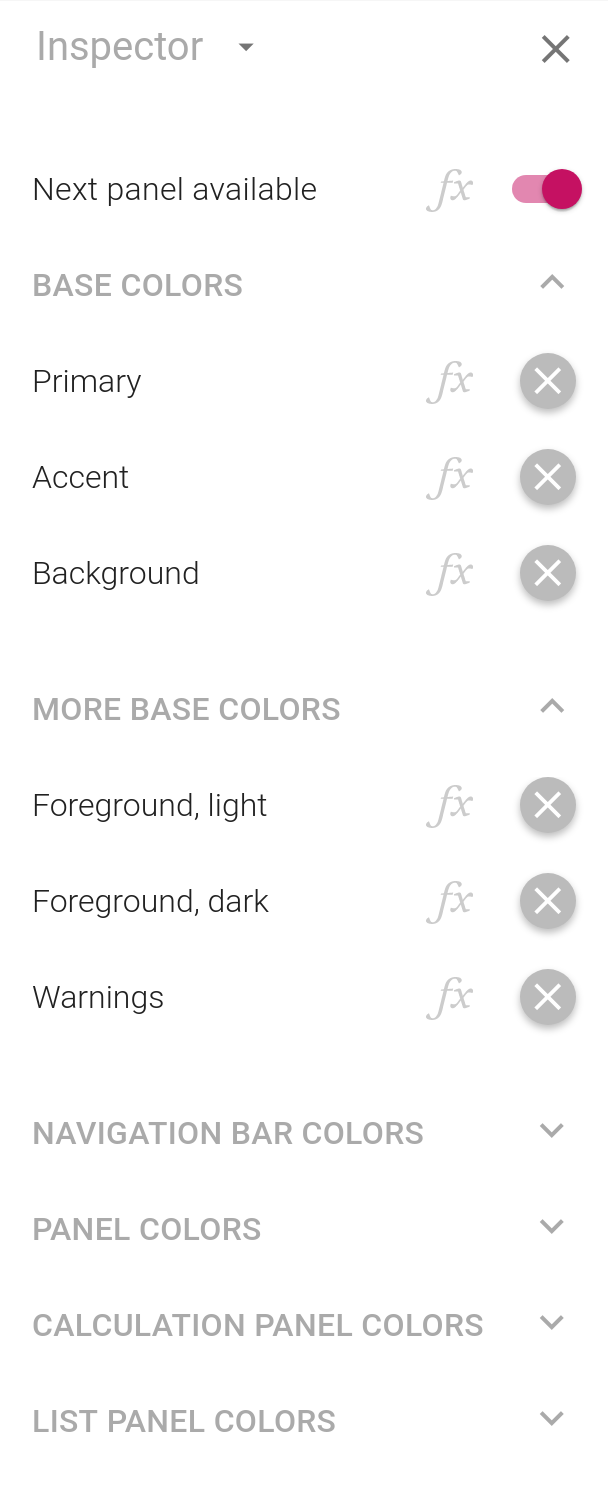
The light foreground color is used for text and icons on a dark background and the dark foreground color is used for text and icons on a light background. The warning color is used mainly for field validation messages. The light foreground color is white by default and the dark foreground color is black. Most of the time, these extra base colors can be left as-is (in which case the inspector displays the symbol).
Setting colors explicitly
While Calcapp can automatically derive all colors from the base colors, you may want to set them explicitly. There are many more colors that can be set by expanding the appropriate sections in the inspector:
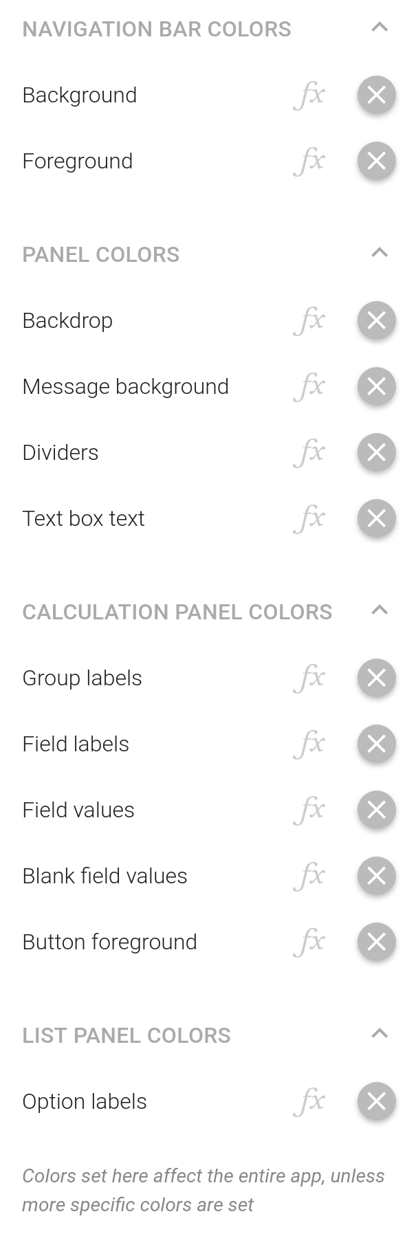
The message background color is used for the messages that appear when an app is ready to be used offline and when reports have been successfully sent. Dividers appear between elements such as fields and list panel options. You can also set the color used for the labels of groups, buttons, fields and list panel options and the color used for field values (including when there is no value).
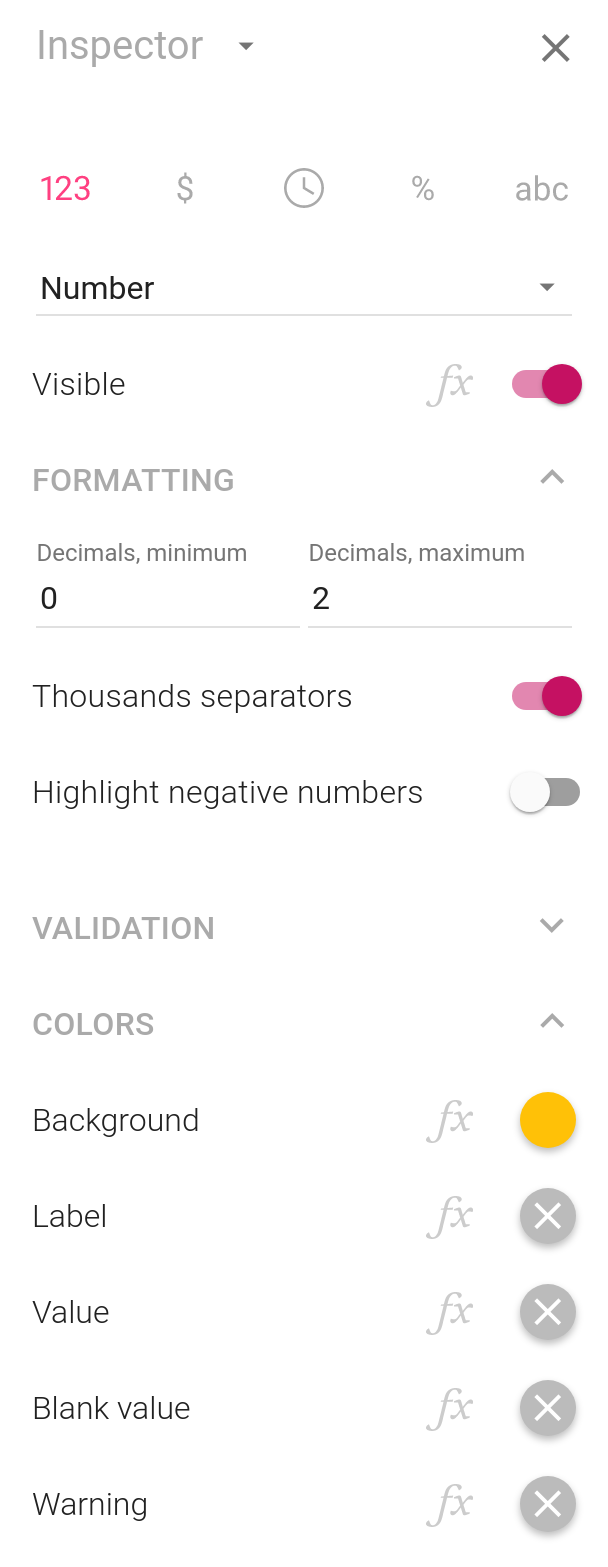
All these colors are set on the panel, meaning that they apply to all elements of the panel. You can also select elements individually to change individual colors. To change the background color for a specific field, select it and then make the change in the inspector. These are the properties displayed by the inspector for a field, with the background color set to a deep amber color, and the resulting app:
Inheritance
The inspector displays the symbol for colors which have not been set explicitly. Above, we describe what happens when colors are not set: base colors use default values and the other colors are derived from these base colors.
To be precise, this is only true if colors cannot inherit from other colors. Panels always try to inherit their colors from the preceding panel if not set explicitly. The first panel of your app can’t inherit any of its colors, as there is no preceding panel, so it will use default or derived values. The panel following that panel, though, will inherit its colors from the first panel for the colors not set explicitly.
You can think of it as the second panel copying the colors of the first panel. That enables you to set colors that should be used everywhere only once, on the first panel.
Let’s say that your first panel is a list panel, enabling users to choose between two different areas of your app. Each list panel option is associated with a calculation panel. Each calculation panel is then followed by another calculation panel, for a total of one list panel and four calculation panels. Here’s how this panel hierarchy would be visualized by the Panels sidebar:
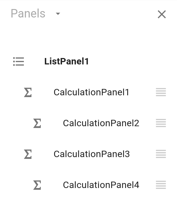
If you set a background color for CalculationPanel1, CalculationPanel2 inherits and uses that background color, unless an explicit background color is set for CalculationPanel2. The other calculation panels are unaffacted by the background color set for CalculationPanel1. CalculationPanel4 uses the background color of CalculationPanel3. If CalculationPanel1 and CalculationPanel3 have no explicit background colors set, the four calculation panels inherit their background colors directly from ListPanel1, the first panel. If ListPanel1 has no explicit background color set, only then is a default value used (white).
The upshot is that you can easily define different areas of your app that share the same colors. Also, to set colors that affect your entire app, make sure to set them on the first panel and don’t set colors explicitly for any of the other panels (their colors should display as in the inspector).
A panel inherits colors from the panel preceding it. A group inherits its label color and background color from the panel it is part of. Fields and buttons in turn inherit their background colors from the groups they are part of and their other colors from the panels they are placed on.
Colors can also be set using formulas, but that is the topic for a different blog post.