Our new release enables you to customize the colors of your apps. To do so, you use the new color picker that is part of the inspector. To display it, click a color in the inspector and you’re presented with a palette of commonly-used colors:
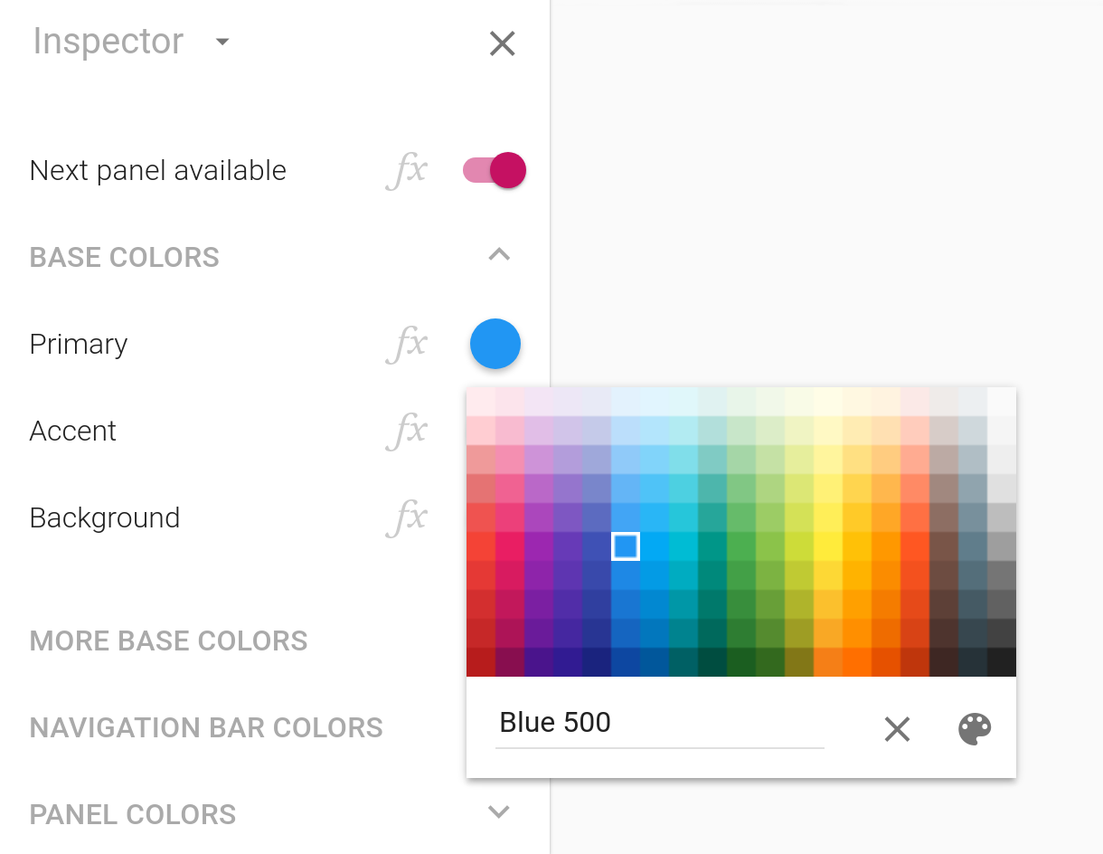
The palette is based on Google’s Material Design visual language, and is made up of colors designed to work well together. While Google’s color palette is used on Android, its colors work well on iPhone, iPad and the desktop too. Select a color to display its name in the field below the palette. Colors in the palette have names such as “Red 500”.
Of course, you’re not limited to pre-defined colors. Press the button to select any color you desire:
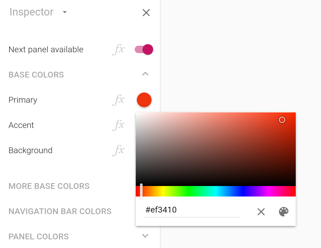
The large rectangular area enables you to select the saturation of the color on the horizontal axis and the vertical axis allows you to select the brigthness. As such, white is in the upper-left corner and black in the lower-left and lower-right corners. The most saturated color is in the upper-right corner. The small strip below the rectangular area allows you to select a hue.
When you select a color by choosing its hue, saturation and
brightness, the name field displays text strings like #ff0000 (bright red).
This is a name uniquely identifying a color and this format is used
pervasively on the Web and elsewhere.
Supported color names
You can enter colors in a variety of formats in the name field. Here’s a small sampling of acceptable values you can enter:
red
lime
black
white
antiquewhite
red 500
Deep Purple A700
#f44336
#0091ea
rgb(255, 0, 0)
rgb 255, 0, 0
rgb 100%, 0, 0
hsb 100%, 50%, 100%
hsb 255, 128, 255
hsv 100%, 50%, 100%
hsv 255, 128, 255
hsv 255 128 100%
hsv(255 128 255)
hsl 255 100% 100%
A large number of named colors are supported, such as yellow and green. See below for
the complete list.
You can also enter colors using the color models RGB, HSL and HSB (also known as HSV). These color models are typically used by graphic designers to describe and reason about colors. RGB stands for red, green, blue and is the most common way of describing colors, as being made up of varying degrees of red, green and blue. HSB stands for hue, saturation, brightness, HSV stands for hue, saturation, value and, finally, HSL stands for hue, saturation, lightness.
In addition to setting colors using the color picker of the
inspector, you can also use formulas to make these decisions while
your app is run, based on field values entered by your user. The new
COLOR function takes a single text parameter and returns a color.
That text parameter accepts the same input as the new color picker,
meaning that formulas such as COLOR("red") and
COLOR("Deep Purple
          A700")
are valid.
Named colors
These are the supported named colors:
Material Design colors
In addition to supporting named colors, the new color picker also supports the colors defined by Google’s Material Design visual language, which are displayed in the palette view of the color picker. Each vertical band in the palette is made up of colors from a named color swatch, including Red, Deep Purple, Indigo and Teal. Within a swatch, each color has a numeric name: 50, 100, 200, 300, 400, 500, 600, 700, 800 and 900. We suggest using the 500 colors as backgrounds in your apps.
There are also more saturated colors in each swatch known as
accent colors, which are appropriate for smaller areas (such
as the thumb color of a switch field) and are named A100, A200, A400
and A700. Enter a Material Design color in the color picker by first
entering the name of the color swatch and then the number. Examples
of color names you can enter from the Material Design palette include
Red 500,
Deep Purple
          50
and Cyan
A100. These names are also accepted by the COLOR formula
function.