Our new release not only supports steppers for quickly increasing and decreasing the values of number fields, it also supports sliders. A stepper consists of two buttons displayed next to the field, where one button increases the value and another decreases it. Steppers are fairly compact, but can be frustrating to use if you want to make large changes to the value. Sliders take up more space, but make it very easy to experiment with various values within a defined range.
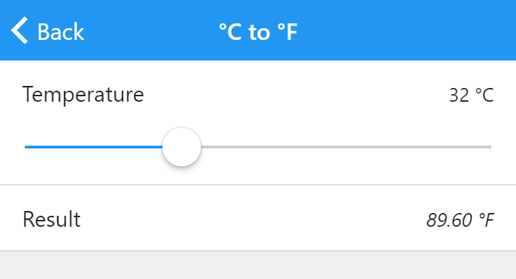
Here’s the temperature conversion template, improved with a slider:
Enable a slider by toggling the new Show slider property in the inspector for number fields. A few new properties then appear:
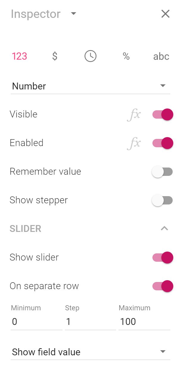
Every slider has minimum and maximum values, which are set in the inspector. When the thumb of the slider is at its leftmost position, the minimum value is used. Similarly, the maximum value is used when the thumb is at its rightmost position.
The default step value is one, meaning that when you drag the slider thumb, the value is at a minimum increased or decreased by one. If the minimum value is zero and the maximum value is 100, you can set the step value to 20 to ensure that only the values 0, 20, 40, 60, 80 and 100 can be set using the slider.
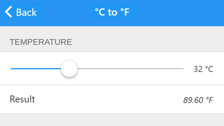
Sliders are displayed on a separate row by default, meaning that the field and its label and value are displayed above the slider. We think that this default is appropriate in most contexts, as you want the slider to be as big as possible to enable users to easily drag its thumb.
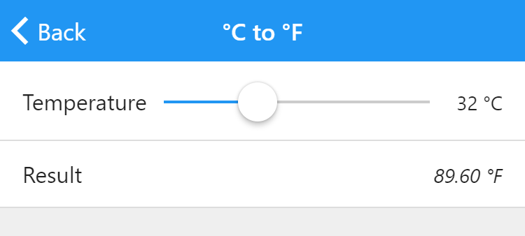
If you elect not to show a slider on a separate row, it is displayed between the field label and its value. Here’s the previous app with a slider displayed in that way:
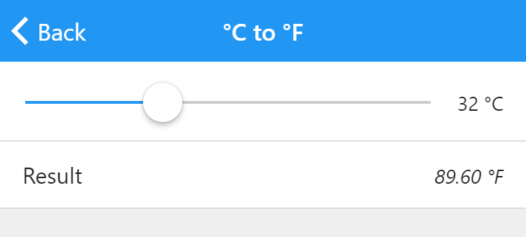
When the slider is displayed on the same row as the field value, we recommend making the label as short as possible to leave room for the slider. Here, it has been completely removed:
In this configuration, there is even space for a stepper:
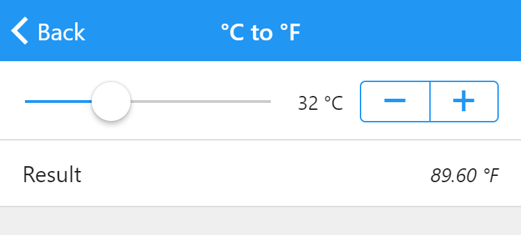
You can use the combination of a slider and a stepper when you want your users to make coarse changes with the slider and fine-tune the value with the stepper.
If you like, you can also move the label to the group the field is part of:
By default, sliders provide an additional way to enter a number — users can still click or tap the actual number and use a physical keyboard or on-screen keypad to change the value in the traditional way. Use the drop-down menu that initially reads Show field value in the inspector to either disable the value (making it grayed out and impossible to change using a keyboard or keypad) or to hide it completely.
Finally, three new color properties are available for determining the colors of sliders: the color of the slider thumb (which the user drags), the color of the track (the horizontal groove in which the thumb runs) and the color of the active part of the track, that is, the colored part to the left of the thumb. As with all color properties, you can use a formula to determine these colors, meaning that the colors of the slider can change with the value.