Our new release contains a much-requested feature: dedicated buttons for easily increasing and decreasing the values of number fields. This type of control is known as a stepper in iOS. Sometimes, they’re called spinners.
Here’s the break-even analysis calculator from the tour template, improved with steppers:
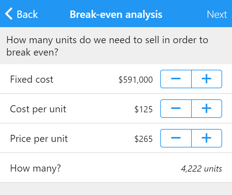
You can click and hold, or tap and hold, the buttons to quickly increase and decrease values without having to release your mouse button or lift your finger.
Steppers are especially valuable on mobile devices without physical keyboards. They allow you to quickly test various numeric inputs and watch the results change, all without having to bring up the on-screen keypad.
Our new release also introduces sliders, which provide an even faster way to change numeric values, but occupy more space. A slider can be shown instead of a stepper or alongside it.
Enable a stepper by toggling the new Show stepper property in the inspector for number fields. A few new properties then appear:
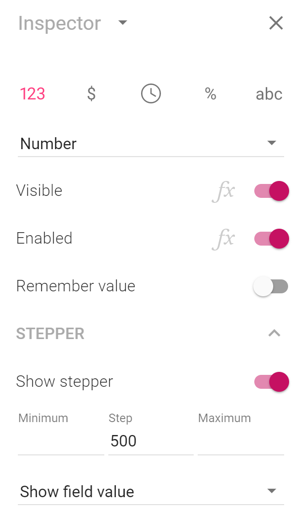
By default, steppers have no minimum or maximum values, meaning that numbers can be increased or decreased in perpetuity. Set a minimum and a maximum value using the inspector. When the minimum value is reached, the button for decreasing the value becomes grayed out. Similarly, the button for increasing the value becomes grayed out when the maximum value is reached.
The default step value is one, meaning that when you increase or decrease a number, it is increased or decreased by one. If you expect users to enter very large or very small numbers, changing the step value makes sense (to, say, 1000 or 0.001).
By default, steppers provide an additional way to enter a number — users can still click or tap the actual number and use a physical keyboard or on-screen keypad to change the value in the traditional way. Use the drop-down menu that initially reads Show field value in the screen above to either disable the value (making it grayed out and impossible to change using a keyboard or keypad) or to hide it completely.
Hiding the value can make sense in some situations. For instance, what if you want to allow your users to determine the number of fields that are visible? You can put a stepper below the last visible field and hide the value for a clean look. Also, you can opt not to enter a label for the field to only show the stepper.
Here’s a calculator app that uses this technique for calculating a grade point average (GPA) for a student:
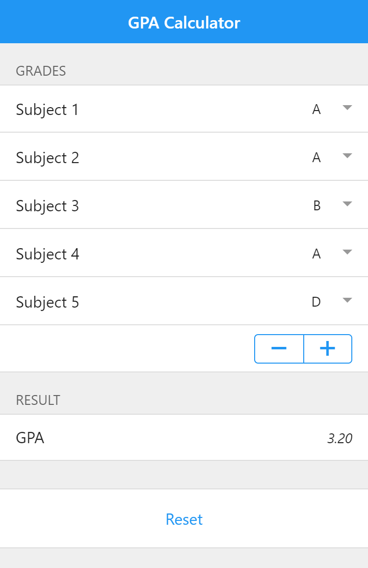
The user presses the plus button to add a new subject for which a grade can be entered and the minus button to remove the last added field. This technique is explored in-depth in this tip, which shows how the app above is built.
Finally, a new color property is available for determining the color of the stepper. As with all color properties, you can use a formula to determine the color, meaning that the color of the stepper can change with the value.