While we’re busy adding support for major new features, a number of smaller improvements will also make their way into our next release:
Easily check all items
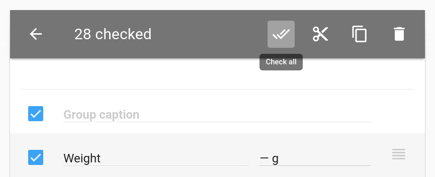
There is a new button in the toolbar which is displayed when you check items:
The new button checks all items. Today, when you check an item representing a group, all items that belong to that group are checked. Checking all groups in order to check all items is more convenient than checking the items individually, but can still be a chore if you have many groups in a single panel. With the new button, checking all items is more convenient.
This means that you can easily remove all items but exclude a few that you want to keep. Simply check all items using the new button and remove the check marks from the items you care about before pressing the trash can button. As before, click the back button to uncheck all items, removing their check marks.
Finally, you may notice that the clipboard-related buttons are no longer grayed-out. (They will enable you to copy items to the clipboard in the future.) Unfortunataly, all they do now is present you with a message telling you that they haven’t been implemented yet. We get so many requests for this feature that we wanted to do a better job of communicating the fact that this feature is not available yet.
Prevent persistent fields from being reset
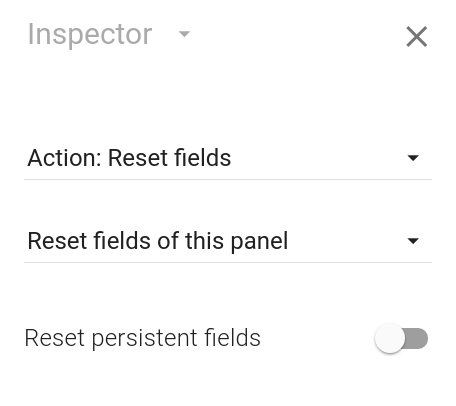
A new option has been added that prevents reset buttons from operating on persistent fields:
If you uncheck this option, a reset button resets all fields but not persistent fields. If you use persistent fields as a way for your users to store values which are unlikely to change, this should be a welcome change.
We’re aware that you may need more fine-grained control over which fields are reset. With calculated properties arriving in the near future, we’ll soon have the tools we need to enable you to determine which fields to reset using a formula.
Accessing the formatted value of a field
There are lots of options for formatting values of number fields and date and time fields. Numbers can be formatted as fractions and as scientific values and you can control the number of decimal places that are used. Dates can be formatted in myriad ways as well.
The only problem is that there’s no way to access the formatted values from formulas. That means that you can’t incorporate formatted values in text fields which span multiple lines. (You can use formula functions to redo some of the formatting work, like rounding a value to a certain number of decimal places, but that’s unnecessary work. Manually formatting a number as a scientific value, for instance, would be even more work.)
As you’ve probably heard by now, we’re working on calculated properties which will enable you to determine things like the visibility of a field and whether a button is enabled using formulas. This feature will not be available in our next release (but it will be available in the release following that release). However, the low-level work to enable calculated properties has been completed, which means that we’ll be ready to surface some of that work in the next release.
Specifically, you’ll be able to access the formatted value of a number field or a date and time field using the FormattedValue read-only property. The formatted value includes the units you have associated with the field, meaning that the formatted value of a field may be a text string such as “$2.02” or “42 lbs.”
If you read our post on text fields with multiple lines, you may recall that we used this formula to present a formatted text string to the user in a text field:
In order to present the value of the TemperatureInCelsius
field, we had to use the ROUND formula function to ensure that we
presented a whole number. We also had to add the unit (& " °C") manually,
despite the fact that the field is associated with that unit. Had we
wanted to do more complex formatting (like including thousands
separators), the formula would have been far more complex.
Using the new FormattedValue read-only property, we
can replace ROUND(TemperatureInCelsius) &
" °C" in the formula with TemperatureInCelsius.FormattedValue.
Much simpler.
Remembering the scroll position when switching panels
Here’s a small improvement that we think will improve your workflow when creating apps: panels in Calcapp Creator now remember how far down you’ve scrolled when you press the back and forward buttons. That means that if you’ve scrolled to the bottom of one calculation panel, move on to the next panel and do some scrolling and then move back to the first calculation panel, you will find yourself looking at the bottom part of it, where you left off.
Before we took the time to fix this issue, the scroll position was actually shared between panels. That meant that if you scrolled to the bottom of one panel and then moved back to the panel preceding it, you’d be looking at the bottom of the preceding panel, regardless of where you left off. We certainly found the old behavior confusing and we think that getting small details like this one right goes a long way toward making the product more polished.
Better presentation of apps on desktops and tablets
From the inception of the project, we have intended for apps created with Calcapp to be usable not only on smartphones but also on desktop computers and on tablets. However, it’s fair to say that we’ve spent more time ensuring that apps work well on smartphone than on devices with larger screens.
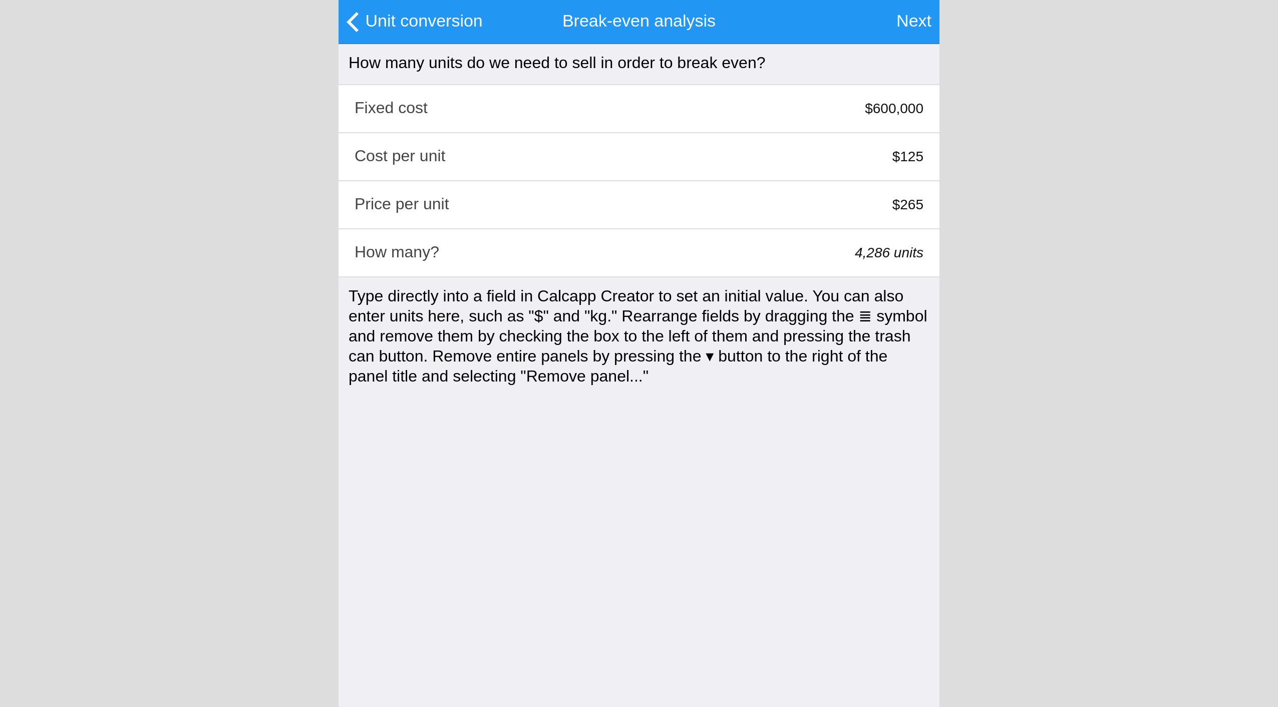
Our next release will take some small steps to improve the experience on desktops and on tablets. Specifically, apps will no longer be unconstrained in terms of their horizontal size. Instead of allowing apps to fill all available space, they will be centered in the middle of the screen:
That’s a pretty poor use of all the screen real estate that tablets and especially desktops offer, but allowing apps designed for smaller screens to fill all available space rarely looks good.
We’d like to do more to help apps make better use of bigger screens in the future. One idea is to enable list panels to be visible at the same time as the panels that follow them on large screens. You would then have the list panel on the left-hand side of the screen and the selected panel on the right-hand side, both panels visible at the same time.


