Calcapp Creator launched in beta in late 2015. It has looked the same ever since.
Last month, we redesigned our website. Moving between the two felt like visiting two different companies. So we gave Creator the same look.
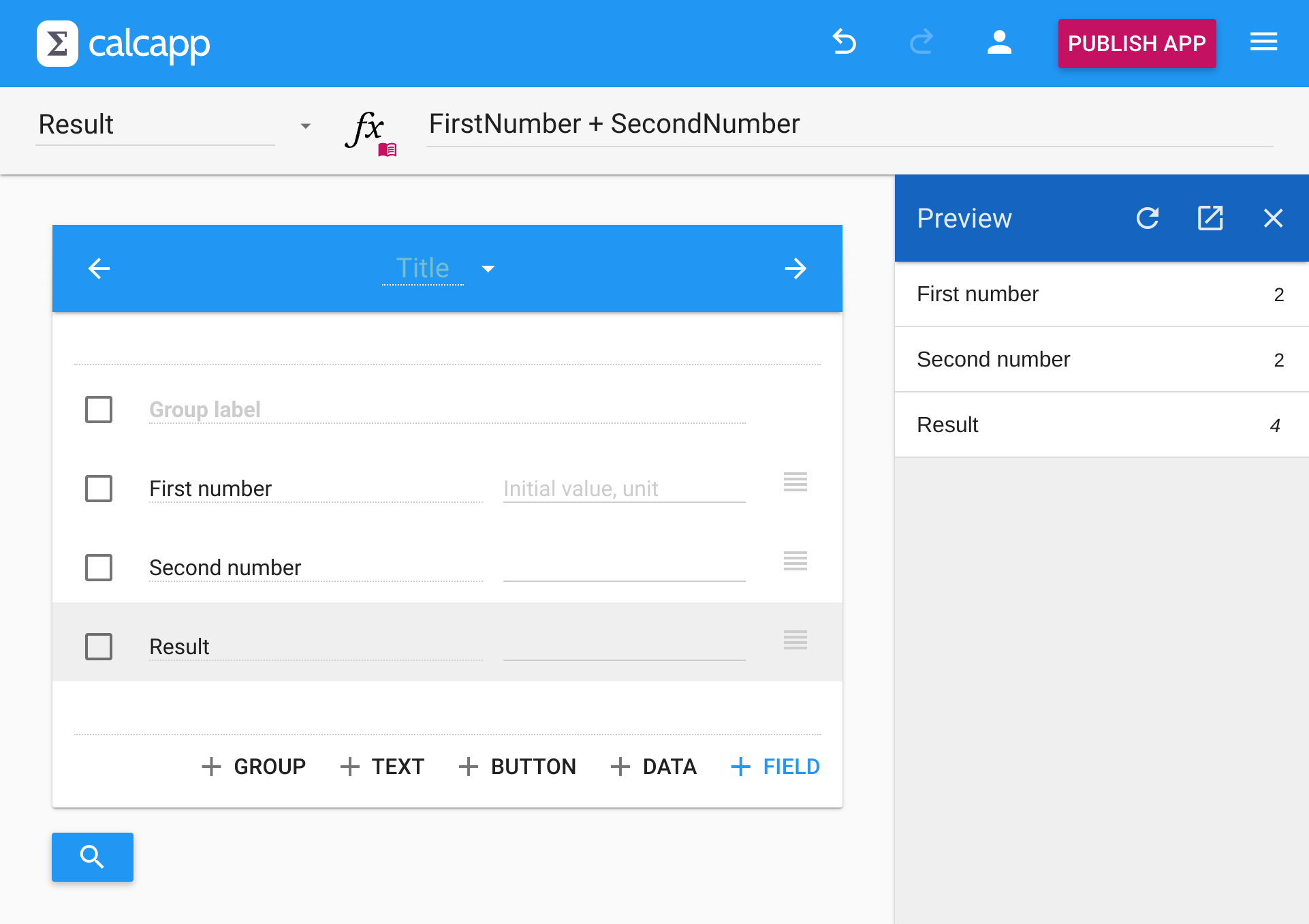
Here is Creator before the change:
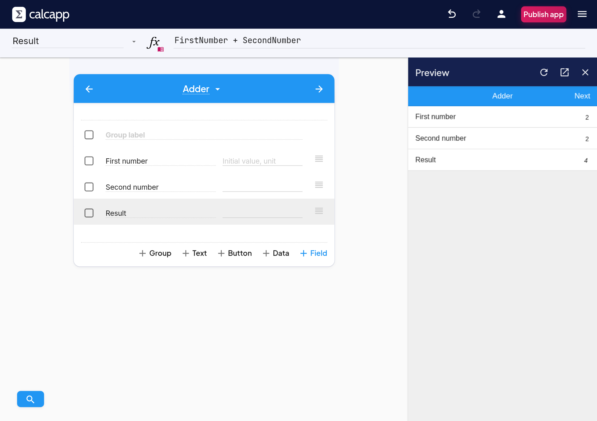
And here it is today:
What’s new
-
New typefaces. Creator now uses the same typefaces as our website. Text is crisper, and titles and buttons stand out more clearly.
-
Formulas in a monospace font. Every character takes up the same width, so it’s easier to tell similar characters apart and to spot a missing parenthesis.
-
Calmer colors. The top bar is now dark navy instead of bright blue, which lets your app take center stage. The Publish button uses the same pink as the buttons on our website.
-
Buttons that don’t shout. Buttons and tabs used to be written in capital letters. They now read like normal text: “Publish app”, not “PUBLISH APP”.
-
Softer edges. Dialogs, menus and cards have rounder corners and lighter shadows.
What stays the same
Every button, menu and field is where it used to be, and at the same size. You don’t have to relearn anything.
The apps you build look exactly as they did before. This change only affects Creator itself.
We’ve also updated the screenshots in our guides, so they match what you see on your screen.
Let us know
If something looks wrong or is harder to read than before, please let us know.