This post was written by David Polberger, Calcapp’s technical co-founder.
You may have noticed that Calcapp looks a little different. Our logo is still a sigma in a box, but the sigma is simpler, and the box is now filled with the deep navy of our website and Calcapp Creator, dark enough to pass for black.


The old logo served us for nearly 13 years, but its sigma is even older. Its story begins with a banana.
It started with a banana
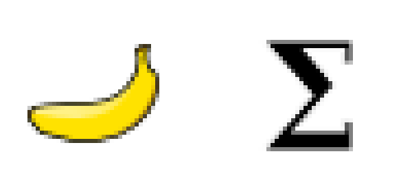
More than two decades ago, I wrote Nutricalc, a calculator that helps doctors and nurses work out the nutrition of babies born too early. (I’ve told the whole story elsewhere.) It was a Windows application back then, and it needed an icon. I found a piece of clip art I was free to use: a banana. Fun, right?
We then gained a large commercial backer, who was less amused. They wanted something more professional, something a bit drier. As a computer science graduate, I had seen more than my share of sigma symbols, which denote a sum. What could be drier and more professional for a calculator than a sigma? I found one I could use freely, touched it up in Inkscape and called it a day.
A detour with a swoosh
The platform behind our medical calculators needed a name early on,
if only for the Java package that held its code. For lack of a better
idea, it ended up in com.polberger.platform.calc.
(We have never owned polberger.com, I might add.) So for years, the
platform was simply known as Calc.
In 2011, we launched a website, and Calc needed a real name. I put “Calc” and “app” together. Perhaps not my most creative move ever, but it worked, and calcapp.net was available.
The first Calcapp logo appeared on that website, and it didn’t have a sigma at all. Instead, I drew a swoosh under the name, in the style of Nike. It looked terrible.

If you want to see it in its full glory, the essay I linked to above has a screenshot of the whole landing page.
Back to the sigma
In early 2014, I set out to build an app designer that anyone familiar with spreadsheets could use. (Internally, we call it Calcapp 3, and it’s still going strong.) Calcapp Creator needed a logo that was square and distinctive, so that it would also work as a favicon, the tiny icon that browsers show in their tabs.
I reached for the old sigma from Nutricalc and eventually put it in a box, to make it look like a proper logo. The typeface for the name came from Google Fonts.
A sigma for today
After nearly 13 years, it’s finally time to retire that old sigma. We’re sticking with a sigma, of course, but a simplified, modern one, rather than the one I pulled out of an unrelated font file all those years ago.


You’ll find the new logo on our website, in Calcapp Creator and in the screenshots of our guides. We think it gives Calcapp a more modern look, and we hope you agree. Either way, let us know. And if you miss the banana, so do I, a little.