Fine-tuning the look
Transform your apps from functional to visually compelling. This guide covers formatting text, adding images, setting brand colors and using dynamic color formulas that respond to user input.
Whether you want to match corporate branding or create apps that change colors based on calculations, these techniques help you create professional, engaging experiences.
Using formatted text
Text boxes in Calcapp Creator offer rich formatting options through the inspector’s toolbars and drop-downs:
Basic formatting
Use the toolbar for common formatting:
- Bold and italic text.
- Bulleted and numbered lists.
- Links to web pages, emails and phone numbers.
- Headings using the Paragraph drop-down menu.
Advanced formatting options
The Formatting section provides additional styling controls:
- Font family and size selection.
- Text alignment .
- Underlined and strikethrough text.
- Code formatting (useful for formulas).
- Quote paragraphs .
Keyboard shortcuts and Markdown
For faster formatting, use keyboard shortcuts:
- Bold: Ctrl+B or ⌘+B
- Italic: Ctrl+I or ⌘+I
- Links: Ctrl+K or ⌘+K
You can also type Markdown-style characters for quick formatting:
To access formatting affecting an entire block of text, type the special characters below on a new line, followed by a space:
-
Heading 1. Type
# -
Heading 2. Type
## -
Heading 3. Type
### -
Bulleted list. Type
*or- -
Numbered list. Type
1.or1) -
Quote. Type
>
Italic and bold are accessed by typing the characters below, substituting
your text for text:
-
Italic. Type
*text*or_text_ -
Bold. Type
**text**or__text__ -
Bold and italic. Type
***text***or___text___ -
Code. Type
`text`
Creating links
To insert a link, select text and press Ctrl+K or ⌘+K, or use the toolbar button. Press Enter when finished.
Link types: Use the menu button to choose between web pages, email addresses and phone numbers:
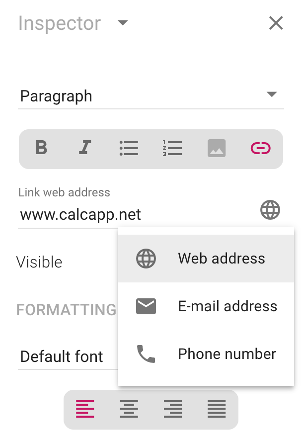
Email links prompt users to compose a new email. Use the Pre-filled email fields section to set subject lines, CC/BCC addresses and message content. Separate multiple addresses with commas.
Phone links work best on mobile devices. Always include the phone number in visible text so desktop users can copy it manually.
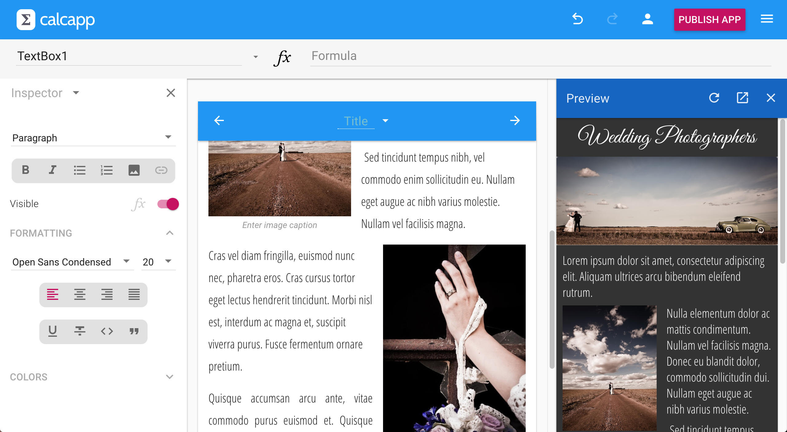
Inserting images in text boxes
Add visual content to your apps using images in text boxes. Multiple insertion methods are supported.
Adding images
Upload from device: Press the toolbar button to select an image from your local drive.
Drag and drop: Drag files from your file manager (Explorer, Finder, etc.) directly into the text box where you want the image.
Paste from clipboard: Copy an image and paste it using Ctrl+V or ⌘+V.
Image positioning and sizing
Select any image to reveal positioning options in the inspector:
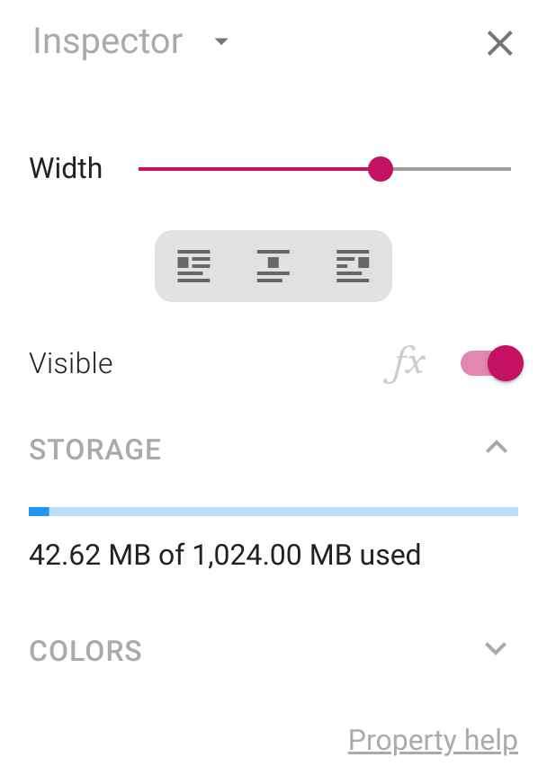
Width control: Use the Width slider to adjust image size. Drag all the way right for full-width images with no margins.
Alignment: Images center by default. Float left or right to wrap text around them.
Storage and optimization
Storage management: Check the Storage section in the inspector to monitor space usage. All apps in your account share storage space, but duplicate uploads only count once.
Responsive delivery: Calcapp automatically creates multiple image sizes and delivers the optimal version for each device. Upload high-resolution images and let Calcapp optimize delivery.
Offline considerations: Apps run offline, so images are limited to 1000 pixels width for offline storage. Very high-resolution images may appear slightly softer on high-resolution screens when offline.
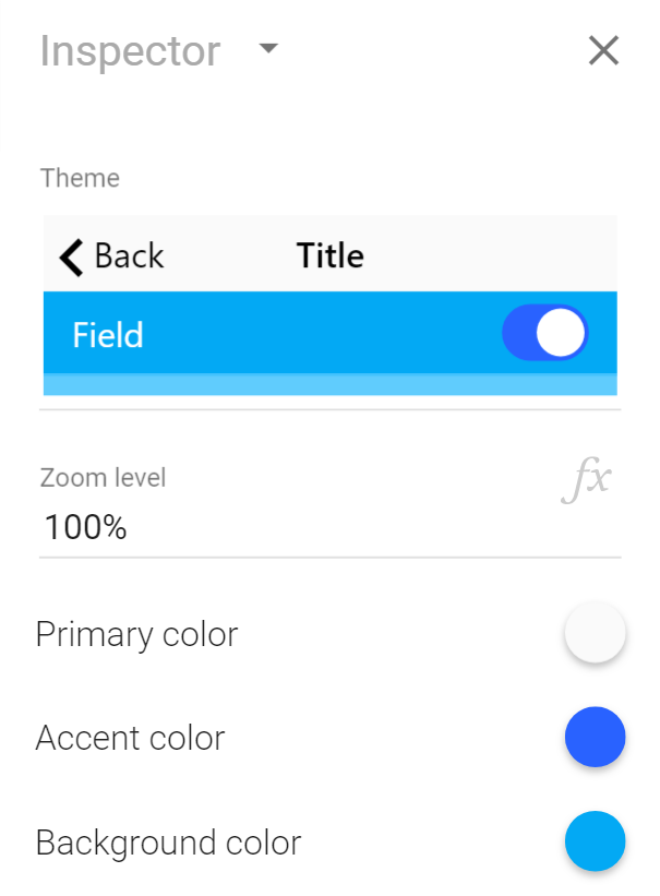
Controlling app zoom levels
Adjust your app’s zoom level to improve readability and accommodate different screen sizes and user preferences.
Setting zoom levels
Access zoom controls from the start screen (press repeatedly in the app designer to navigate there). The zoom setting affects the entire app’s user interface scale.
User-controlled zoom
Create dynamic zoom controls by setting the zoom level through a formula. This enables users to customize the interface to their needs:
- Reference a number field with a slider for user zoom control.
- Make the field persistent to remember user preferences.
- Useful for accessibility and different device types.
Colors
Create branded, professional apps by customizing colors throughout your interface. Colors can be set at multiple levels for complete design control.
Setting app-wide colors
Configure your app’s overall color scheme from the start screen (press repeatedly to navigate there):
Using the color picker
Click any color circle to open the color picker. Choose from curated palettes or access the full spectrum:
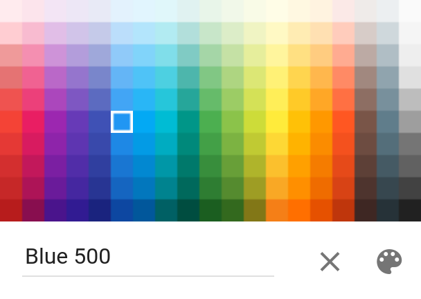
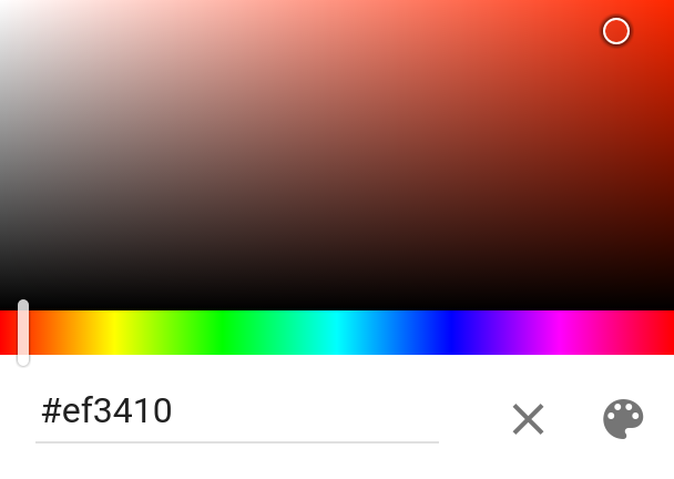
Quick color entry: Type color names (red, darkviolet), hex codes
(#f44336), RGB
values (rgb(255, 0,
0)) or HSL values (hsl 255 100% 100%)
directly. See color formats for complete
options.
Three key colors control everything
Transform your entire app by setting just three base colors:
- Primary color: Navigation bars, button labels, loading screen background.
- Accent color: Switch thumbs, highlights and interactive elements.
- Background color: Areas behind fields and buttons.
Screen-specific colors
Customize individual screens by activating them and modifying colors in the inspector. Screen-level settings provide more granular control than app-wide colors.
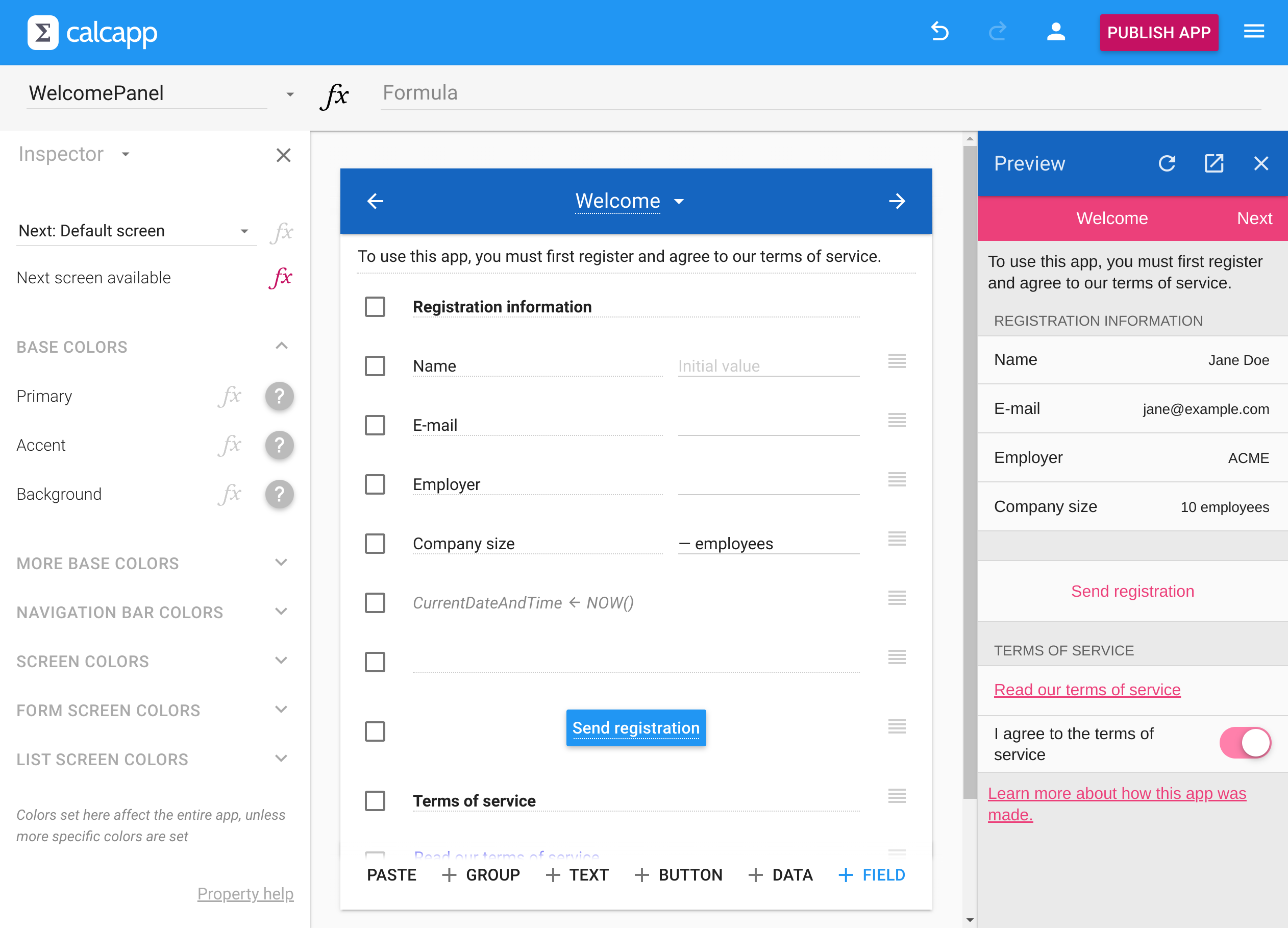
Here, the user registration form demonstrated elsewhere has been given a fresh coat of paint by changing just the three base colors:
Granular color control
Achieve precise design control by setting colors at different levels:
Screen-level colors: Expand the Form screen colors section in the inspector to customize all field labels, backgrounds and other elements for the current screen.
Individual field colors: Select any field and modify its specific colors in the inspector. Use checkboxes to change multiple fields simultaneously.
Color inheritance system
Calcapp uses a cascading color system where undefined colors automatically inherit from higher levels (like CSS):
Inheritance hierarchy:
- Field colors inherit from their form group.
- Form group colors inherit from their screen.
- Screen colors inherit from the previous screen.
- Screen colors of the first screen inherit from app-wide settings.
- App-wide colors can be set using the inspector when you first load your app.
Visual indicators: Undefined colors show as in the inspector, indicating they’ll inherit from a higher level.
Smart adaptations: Some inherited colors are automatically adjusted for better visual hierarchy. For example, the backdrop color is a lightened or darkened versions of the background color.
Setting colors using formulas
Transform static designs into dynamic, responsive interfaces by setting colors through formulas. Colors can react to user input, calculations and field validation states.
Dynamic color applications
Status-based coloring: Change screen backgrounds to red when calculated values exceed safe ranges, creating instant visual feedback.
Field validation enhancement: Highlight invalid fields with custom background colors that complement Calcapp’s built-in validation messages.
User customization: Create settings screens with drop-down fields that let users choose app color schemes. Make these persistent to remember preferences.
Using color formulas
Activate formulas: Click the fx button next to any color setting to switch to formula mode.
The COLOR function: Use COLOR to convert text strings into colors. Accepts the same formats as the color picker:
- COLOR("red")COLOR("red") - Named colors
- COLOR("#f44336")COLOR("#f44336") - Hex codes
- COLOR("rgb(255, 0, 0)")COLOR("rgb(255, 0, 0)") - RGB values
Named color constants: Access predefined colors directly: Color.RebeccaPurpleColor,RebeccaPurple, Color.RedColor,Red and Color.LightBlue300Color,LightBlue300.
See all named colors for complete options.
Conditional colors with IF
Use the IF function to change colors based on user input or calculations. For example, highlight empty required fields by setting this formula on the BackgroundColor property:
Understanding BLANK() behavior: Returning a blank value from a color formula (typically using the BLANK function) has the same effect as not setting a color in the inspector at all, meaning that Calcapp first tries to inherit a color and, if that fails, uses a default color.
Skipping inheritance: To make Calcapp skip trying to inherit a color and have it use a default color directly, use the DEFAULTCOLOR function.
Variable color intensity
Beyond simple on/off color states, you can create nuanced visual feedback using color modification functions. There are many functions for modifying and creating colors.
The BRIGHTEN function: BRIGHTEN makes a color brighter by a given amount (a number from 0 to 100). This is particularly useful for showing gradual changes in field states.
Example - Percentage-based coloring: Setting the background color of a field is a great way to convey that a field is, say, 62 percent invalid, when the either-or mentality of Calcapp’s standard field validation isn’t enough.
To make a field background red when Field1 is 0, white when it’s 100, and light red for values in between, use this formula on the BackgroundColor property:
This creates visual feedback that matches the actual calculated value rather than simple valid/invalid states.
Next, learn about the various buttons you can add to your app »