Using the inspector
The inspector enables you to change various aspects of the selected item (known as properties). If you worked your way through the getting started guide, you likely noticed it on the left-hand side of the window.
The inspector controls all aspects of the selected item. For number fields, you can determine decimal places, formatting (fractions, percentages, currency, scientific notation), visibility, behavior and colors.
There is a video at the bottom of this page demonstrating the concepts discussed here.
Initial values and units
Input fields can have initial values (the values displayed before users change them) and units (text displayed before or after numbers like “34.2 lbs” or “$23”).
Set these in the app designer, not the inspector. Type “32” into the field to set an initial value, or “32 lbs” to add both value and unit. For currency, enter “$23”. You can also add units without initial values by typing just the unit text or using “-“ as a placeholder.
Steppers and sliders
A stepper consists of two buttons displayed next to the field, where one button increases the field value and another decreases it.
A slider takes up more space than a stepper, but enables your users to make rapid changes to a value by dragging the slider handle. Sliders work well for making coarse changes to a value and steppers work well for making fine changes.
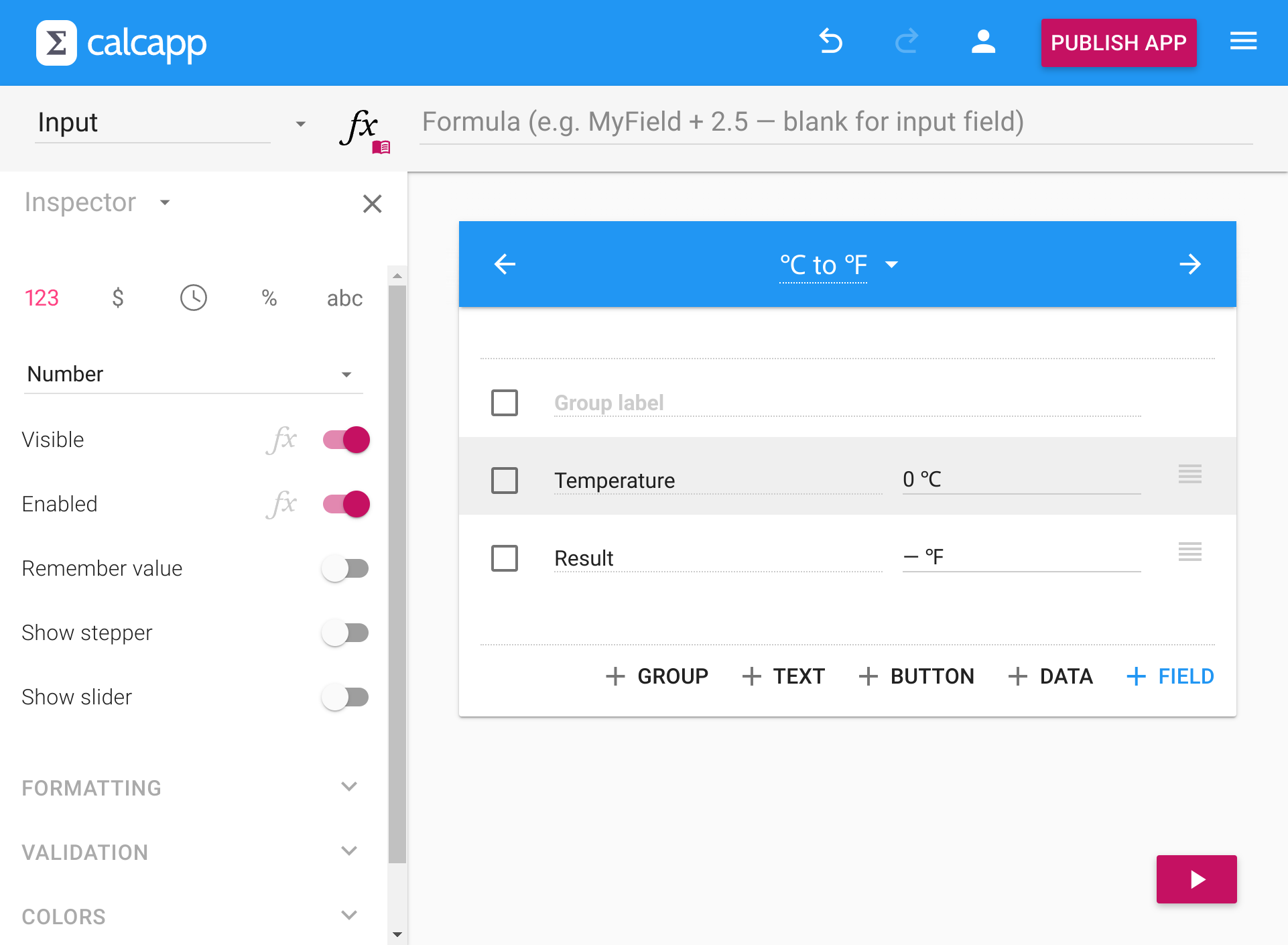
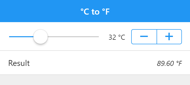
Here is a temperature conversion app that uses both a slider and a stepper for the input field:
Enable a stepper by toggling the Show stepper property in the inspector. Toggle the Show slider property to show a slider.
Sliders must have a defined range, set using the minimum and maximum values in the inspector. Such values are optional for steppers. Both steppers and sliders support setting a step value, which determines the interval between the assigned numbers.
When a slider or a stepper is shown, the field value can be grayed out or hidden completely by using the drop-down menu initially labeled Show field value in the inspector.
A slider is by default displayed below the field label and value. It can also be displayed between them by toggling the On separate row property.
Formatting numbers
Numbers can be formatted in several ways to match your app’s needs.
Plain numbers
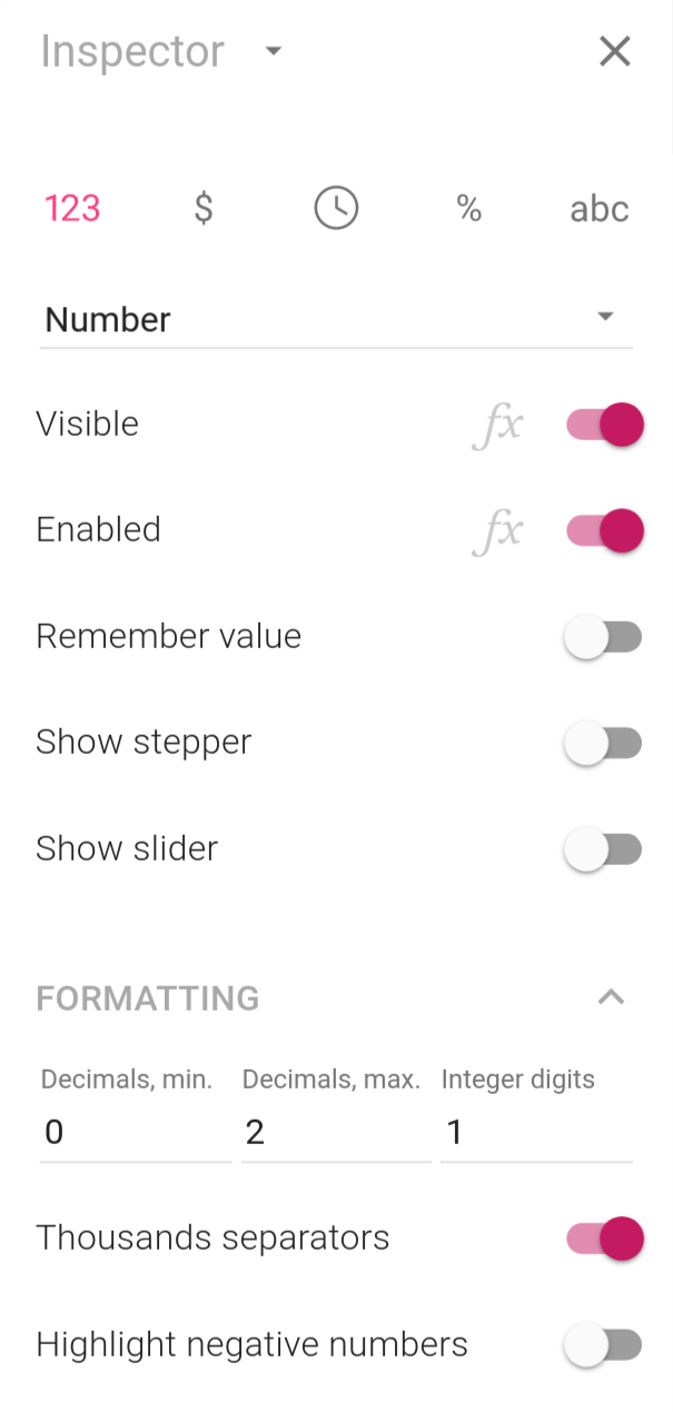
Values are by default formatted as plain numbers. Use the Decimals, min. and Decimals, max. fields to specify the number of decimal places your numbers should be formatted with. (If these numbers are zero and two, respectively, 3.14159 is formatted as 3.14 and 2.10 is formatted as 2.1.)
Use the Integer digits field to specify the minimum number of integers a number should be formatted with. (If this number is four, 42 is formatted as 0042.)
Thousands separators are used by default, but you can toggle the switch to turn them off.
Currency
Format numbers as currency by clicking the $ button. Numbers are displayed in red if negative and use an appropriate currency symbol. Change the currency using the provided drop-down menu.
Percentages
Format numbers as percentages by clicking the % button:
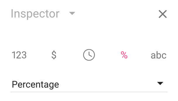
By default, numbers formatted as percentages are displayed with a “%” unit, displayed after the number. In addition, they are automatically scaled, meaning that if the user enters the value 50, the actual value used in calculations is 0.50.
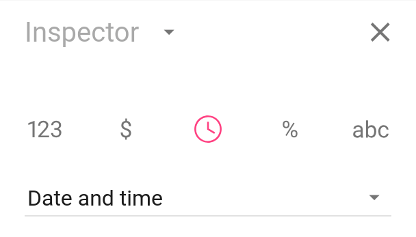
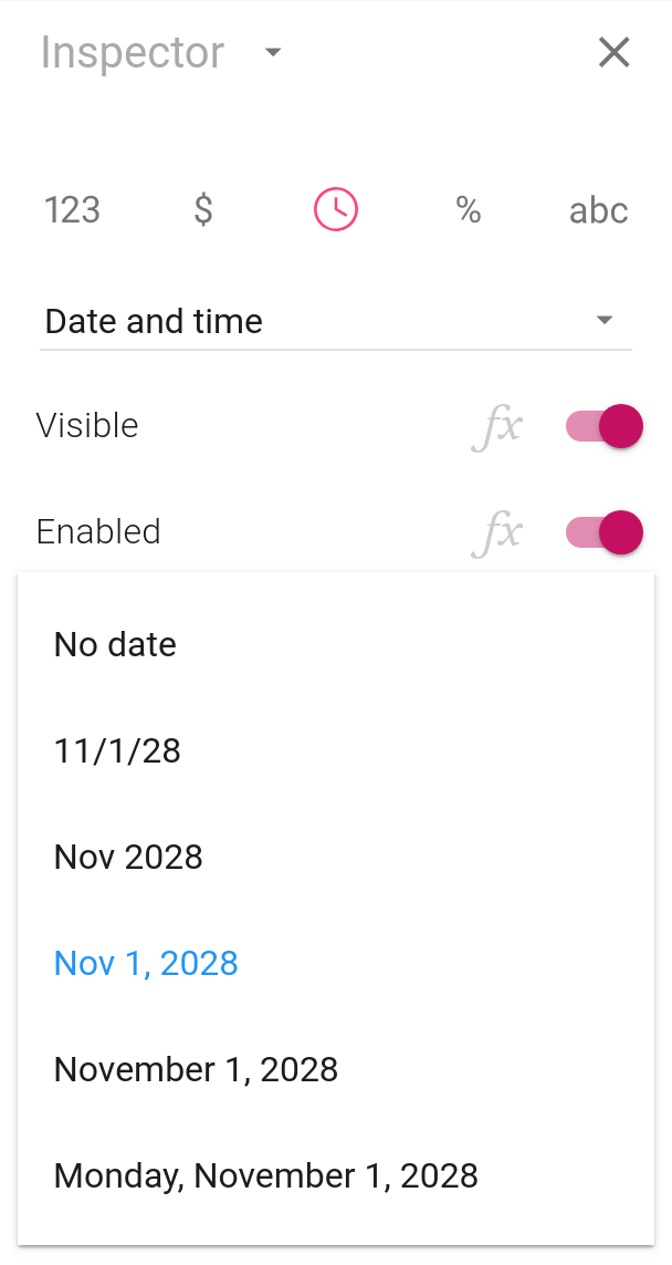
Dates and times
Format a number as a date, as a time or as a date and a time by clicking the clock button:
Use the drop-down menus to determine how dates and times are formatted:
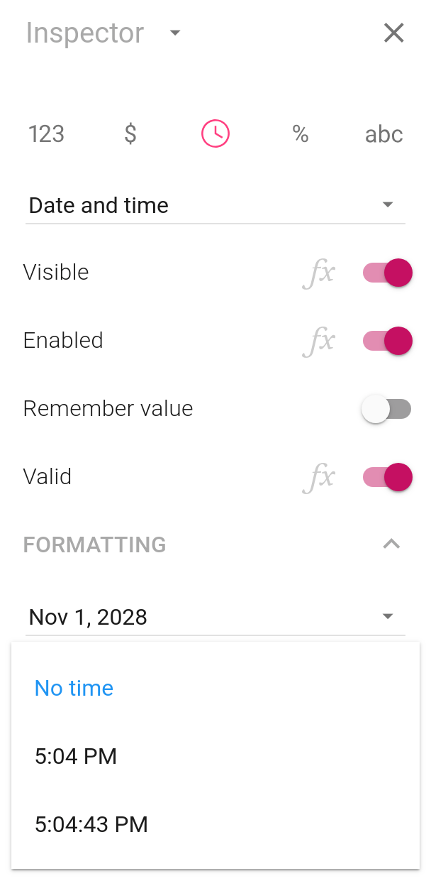
If your app language normally uses a 12-hour clock (which holds true for US English), click Force 24-hour clock to ensure that a 24-hour clock is used for that field.
Date and time values are stored as sequential serial numbers, which can be processed using specialized date and time functions as well as regular functions and operators. For an introduction, refer to our documentation for the Value property of date and time fields.
Date and time fields use native pickers on mobile devices, giving users the date entry method they’re familiar with.
Working with multiple fields
To save time, select multiple items by checking their boxes, then modify properties to apply changes to all selected items:
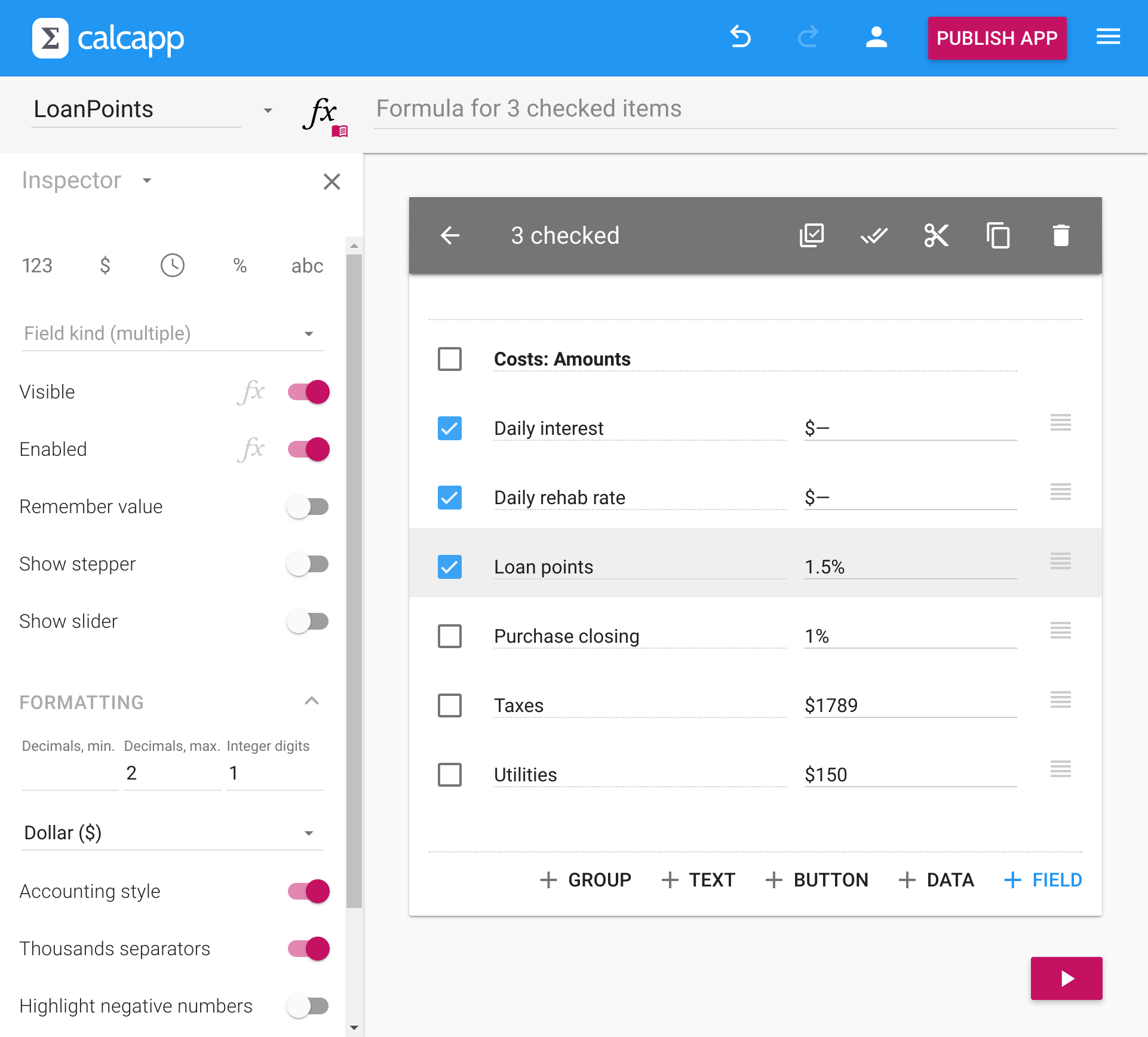
When fields differ in a property, the inspector shows a blank value. When they share the same value, it displays that common value. Changes apply to all selected fields. You can also assign the same formula to multiple fields by typing into the formula field.
Field behavior and validation
Beyond formatting, the inspector controls field behavior:
- Enabled - Toggle to prevent user editing.
- Visible - Toggle to hide fields.
- Remember value - Enable persistence when the app closes and reopens.
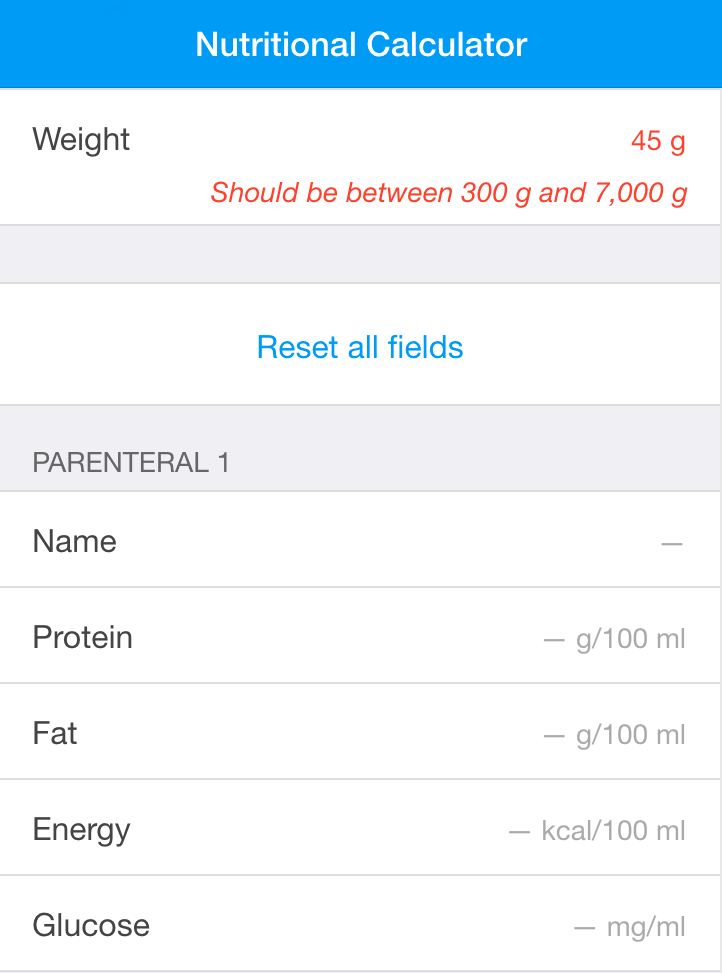
- Validation - Set minimum and maximum values for number fields.
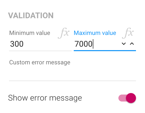
When validation is active, users see helpful messages for out-of-range values:
Formula-driven properties
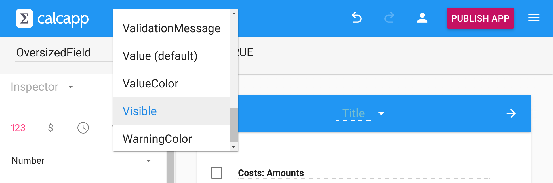
Many inspector properties can be set through formulas instead of fixed values. Look for faint fx symbols next to properties—click them to edit the associated formula.
Formula-driven properties enable dynamic behavior based on user input. For example, show a field only when another field exceeds a threshold (Visible) or enable a button only when required fields are completed (Enabled).
For validation beyond number ranges, use the Valid property with a formula. This works for text fields, date fields and other field types.
The property box
Some formula-driven properties aren’t visible in the inspector. Use the property box to access all available properties:

Examples of properties available only through the property box include InitialValue and the Label property for screens, groups, fields, buttons and list screen navigators.
Referencing properties in formulas
Reference formula-driven properties from other formulas using the syntax ItemName.PropertyName. For example, Field1.VisibleField1,Visible references the Visible property of the field named Field1.
Video recap
(To see a longer video about using the inspector and associating formulas with properties, refer to the video tutorial where we create a user registration form.)
Now that you have learned about the inspector, continue reading about working with formulas »